University Project - Feb. 2024
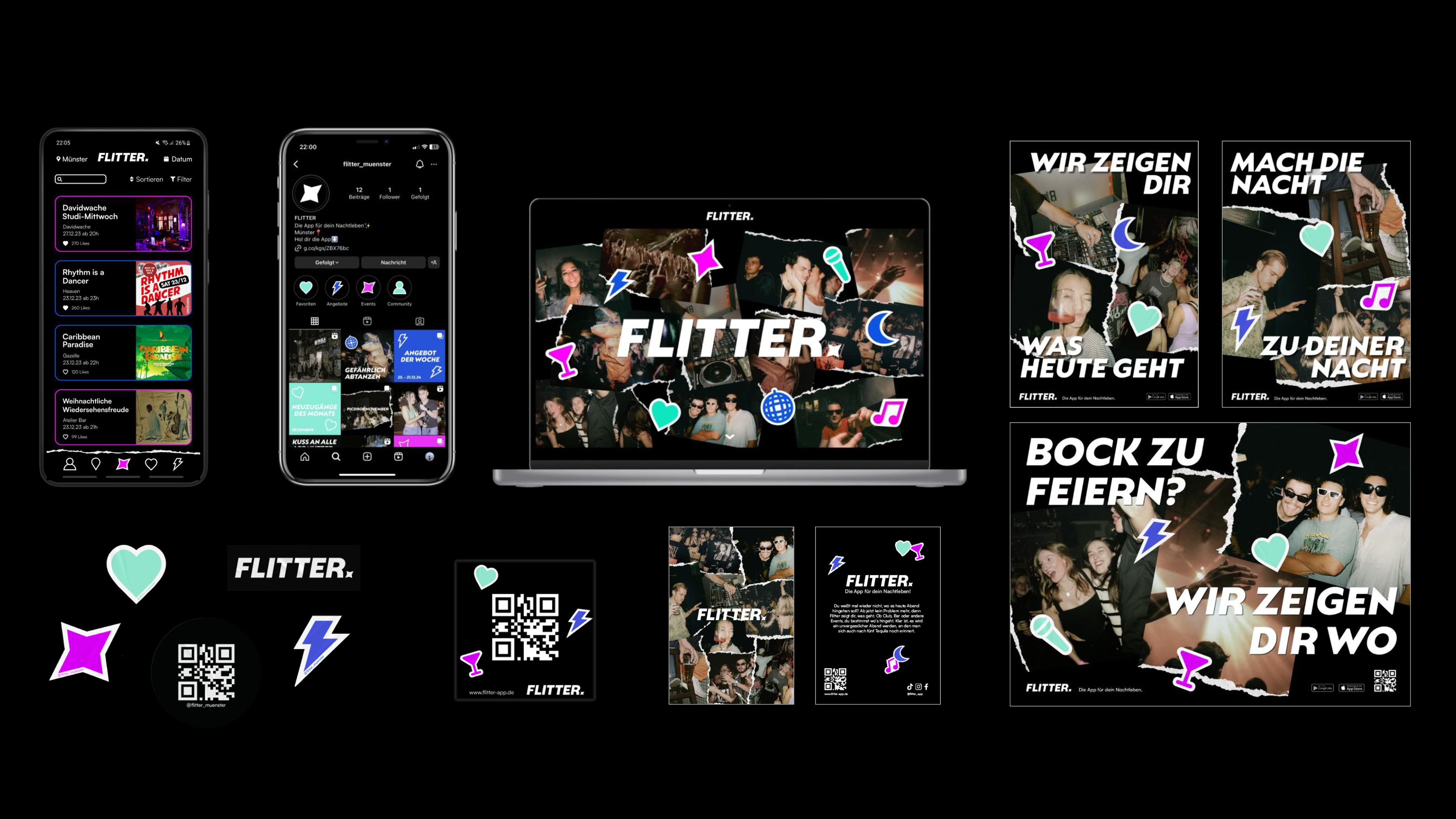
In a corporate design course, the task was to create a corporate design for an imaginary brand. I decided to develop an app that would inform the user about the nightlife in Münster. To promote the app, I created various digital and analogue media.
Concept
My idea was to create the perfect going out app that would inform you about the nightlife activities in Münster. The focus is on clubs, bars and special events like the Oktoberfest. The special thing about the app is that you can save certain events to have a better overview, you can filter for example by music taste and you can see how many likes a certain event got. All these things help you to find the perfect event for you. Another thing is that there are special offers when you use the app. For example, free drinks or free entry under certain conditions.
The app should offer values that the competing apps lack. First of all, FLITTER provides an up-to-date, reliable and structured overview. The events presented are diverse and should inspire the user to try something new and motivate them to go out and support local businesses.
The topic was important to me because after the Corona crisis many bars and clubs went bankrupt. I is also noticed that teenagers who grew up during the crisis developed other hobbies and are not so familiar with going out. With FLITTER, I want to bring more attention to the venues in Münster so that this part of the culture remains present.
The target group of the app are mostly young adults from 16 years on. The people should be interested in activities in their city. Another target group are the oragnisers of the events, because they can promote them in the app.
Logo
In German the word "Flitter" means small shiny particles. The verb "flittern" has many meanings. To sparkle restless, to flicker and to giggle. It also means to throw shiny particles and in carnival it is a small form of celebration. The English word flitter was also very fitting. Especially the phrase "hours flitting by" fitted the context of partying and having fun.
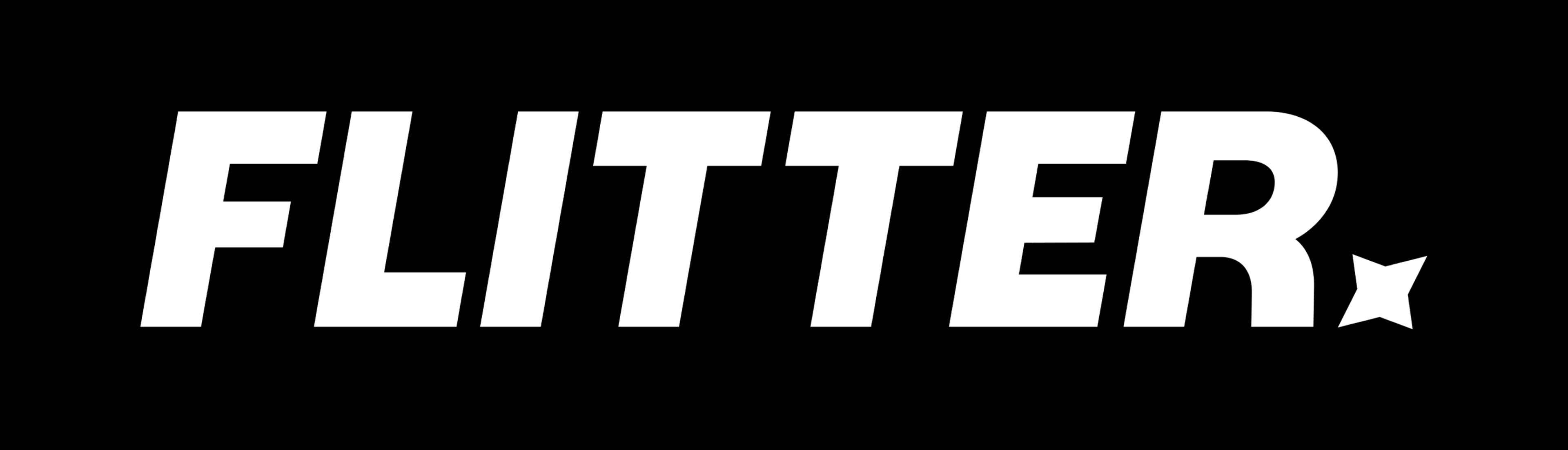
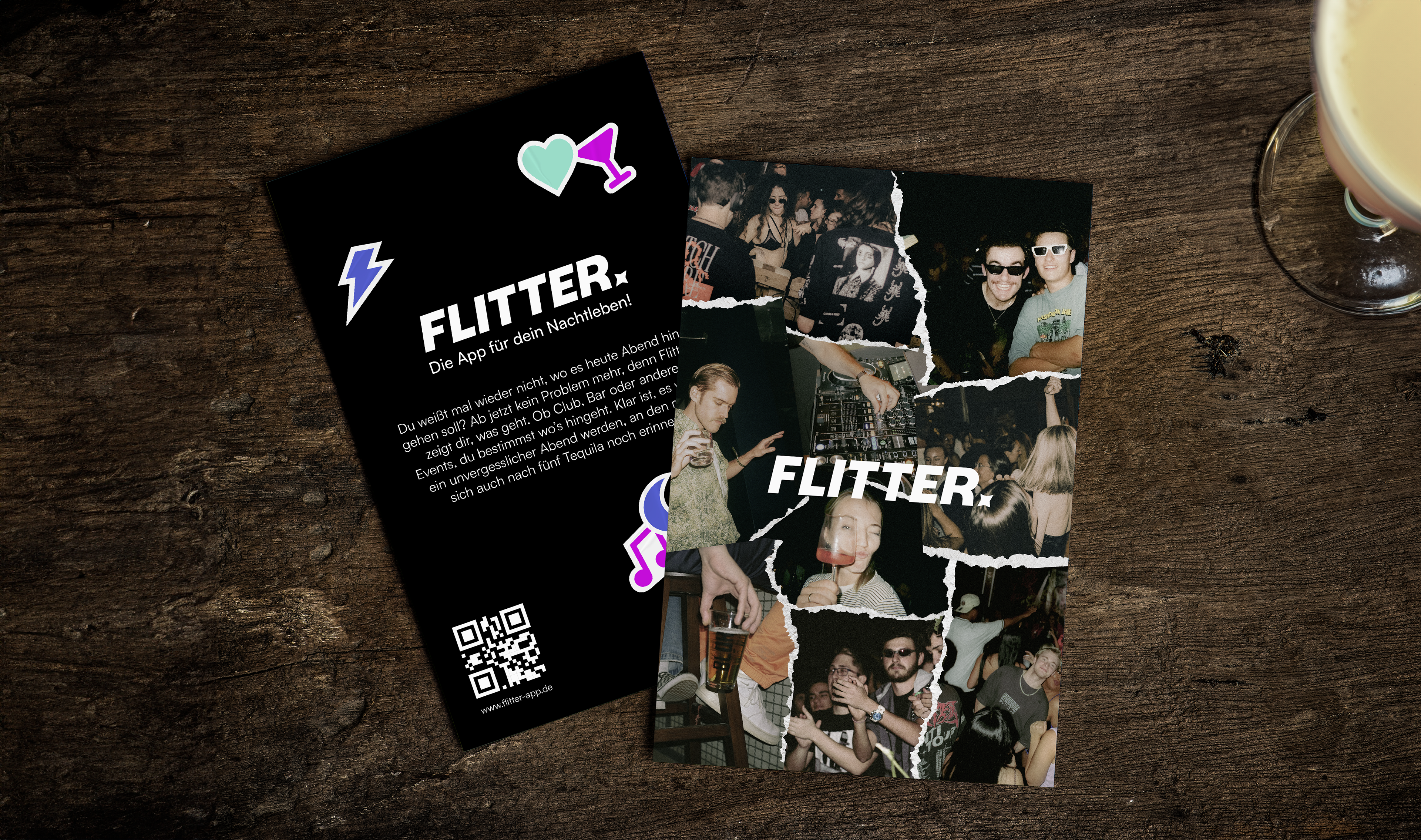
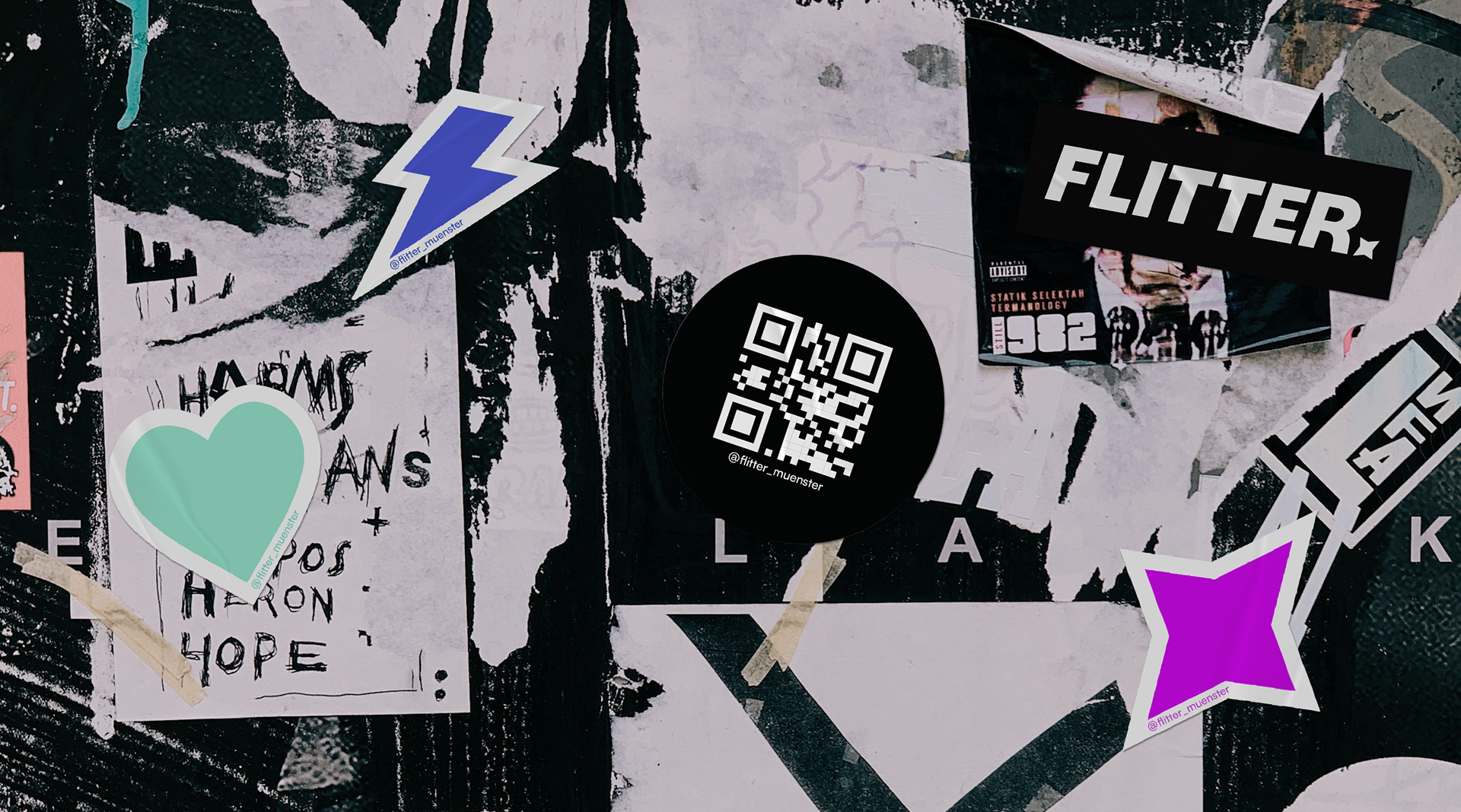
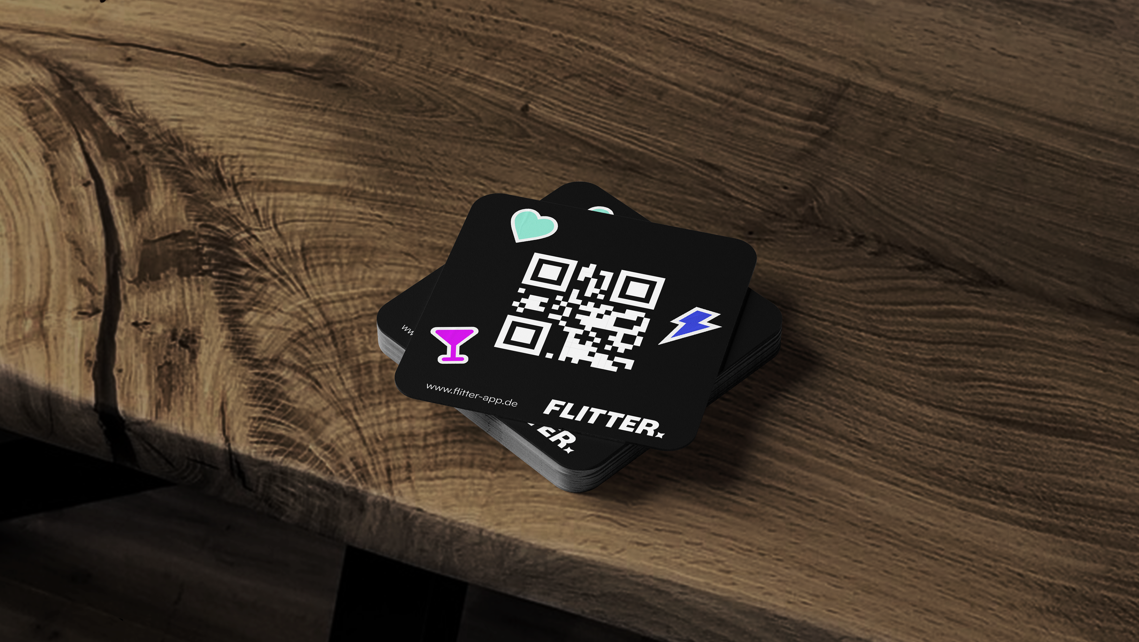
After all this research I decided on the name "FLITTER" and created a word picture mark. I used the Natom Pro typeface in all caps in bold italics to give the logo a moving feel. I wanted it to look confident and reliable. I added the small star icon to make it more unique and to fit the nightlife theme. I also made the star look italic to tie everything together. The reliability should also be represented by the colours black & white, which the logo is always presented in.
Corporate Elements
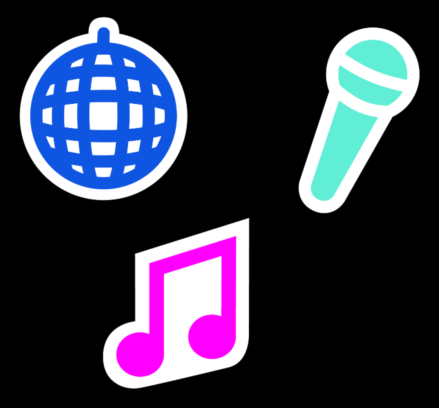
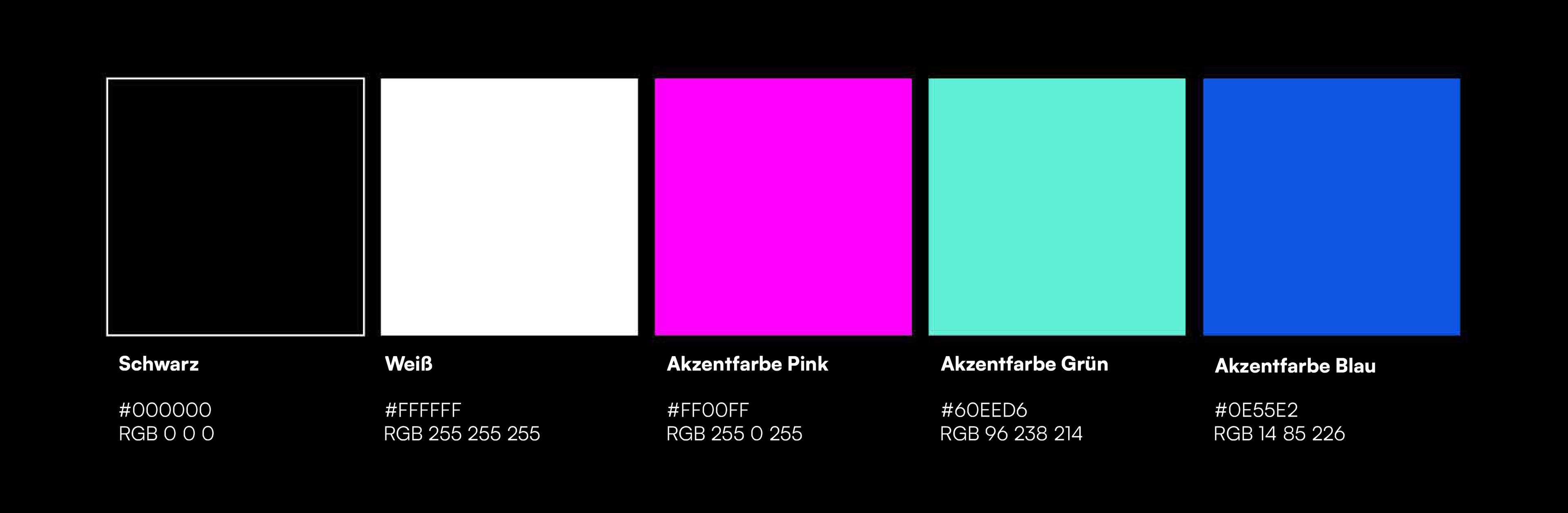
I added the accent colours neon pink, blue and green to make the corporate design more fun. These colours are often used in neon lights in clubs. They were also important for categorising the different events in the app.
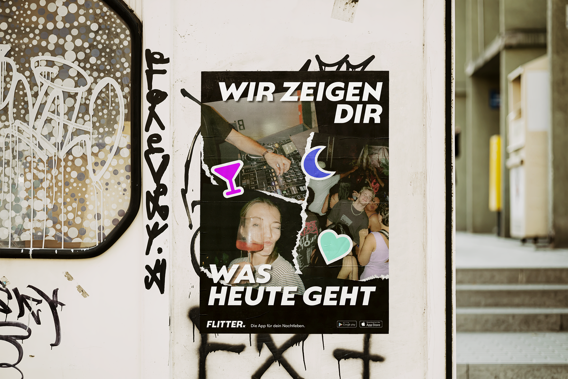
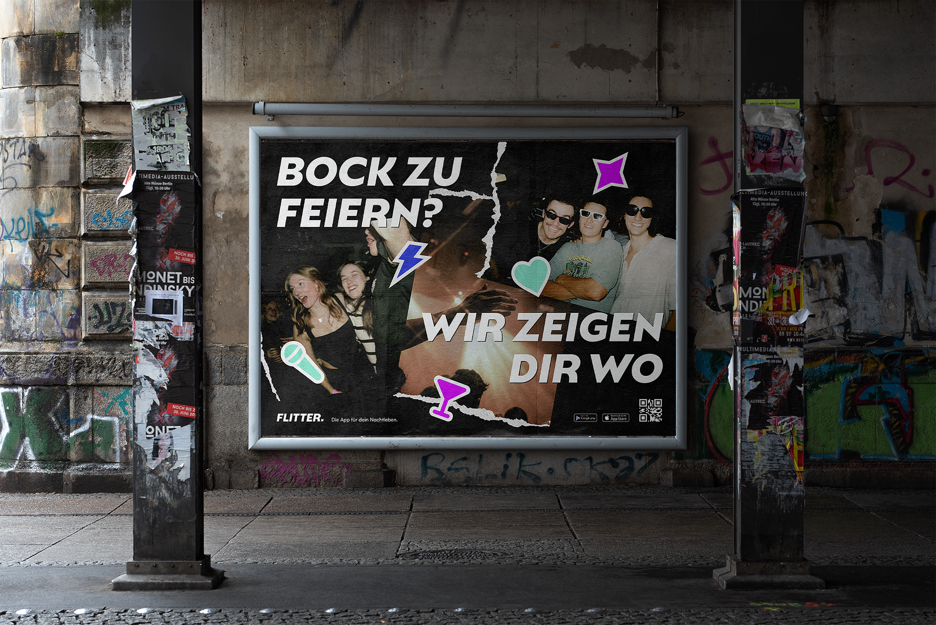
Furthermore I created some icons that are party symbols. All stickers have an outline and are coloured in the accent colours. The icons can be used in two different ways. In digital media they are flat vector-like icons and in analogue media I gave them a sticker structure so that they look like they are being stuck onto the poster, for example.
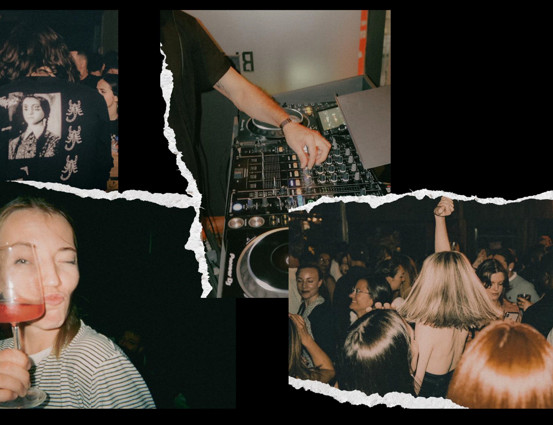
The images I used have a spontaneous and analogue feel to them. I wanted the images to represent unfiltered party life with real people and emotions. To enhance this feeling, I edited the photos as they were shot on film. To add the extra analogue detail, the images have distressed paper edging.
App
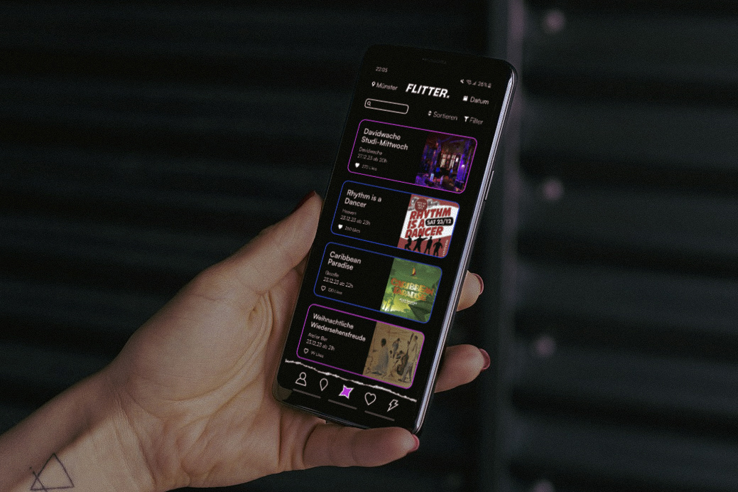
My main focus in this project was the app. In the video below you can see the prototype I developed. After the loading animation you get to a query of what you are looking for. Then you see the start screen with all the events, which you can filter and sort according to your preferences. If you like an event, it is displayed on the favourites page. Then there is an interactive map where you can see all the locations. Lastly, you can see special offers for different locations.
In the app, I used the party icons as the menu buttons and the accent colours to differentiate between the categories: club, bar and special events.
Other Media
To promote the app I needed some other media. Digitally I ceated a Landing page as well as an Instagram account. The analogue media were posters, a postcard, stickers and a beer coaster. The analogue media should be exactly there where the target group is around as well as in bars etc. Every single thing should activate the user to download the app.

Conclusion
I really liked this project because everyone was able to develop their own brand and have complete freedom of design. This course was very helpful in how to work with a corporate design in different media. I really wanted to do someting UI/UX related in this project and I learned more about the important things when designing the interface of an app. I am very happy with the result and think this project was a very good addition to my portfolio.