University Project - Jul. 2023
In my 5th semester I did a course called "Information Design" where we learned how to make good infographics. The course was a collaboration with Amazon Prime Germany. Each team made an infographic for an Amazon Original series. In addition to the poster, we also created a prototype of a mini-game that fit the theme.
Concept
The series we chose, "The Discoutnter", is a funny mockumentary, similar to the American series Superstore. So it was clear from the start that we wanted to make a very humorous infographic that captured the mood of the show.
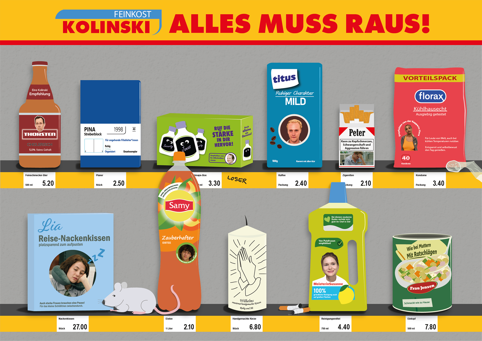
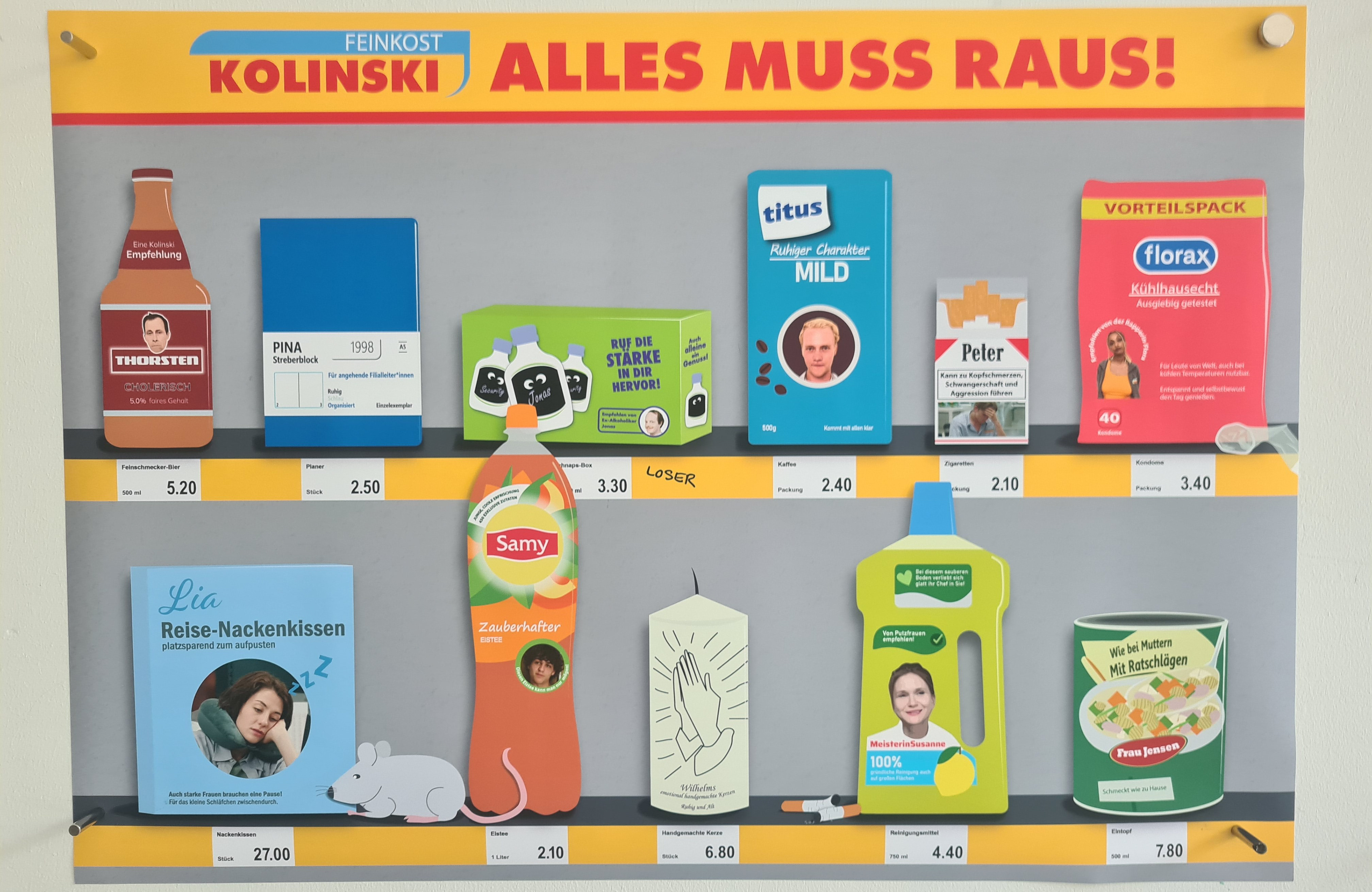
We started by doing a lot of research, watching the series and interviewing other students. Over the next few weeks we brainstormed about what information we wanted to put on the poster. We did brainstorming sessions and sorted our ideas using a 4-box model. After this process, we decided that our infographic should represent the main characters as supermarket products on a shelf. The product slogans should give more information about each character.
Before we could start designing, we had to analyse the characters to find out which product they should be. In the show the characters are somewhat stereotypical. For example, there is an aggressive chef who has absolutely no idea how to run a shop on his own. For most of the people it was not difficult to find a suitable product.
Once we had them all, we divided up the work and each created a few products in Illustrator.

Design Process
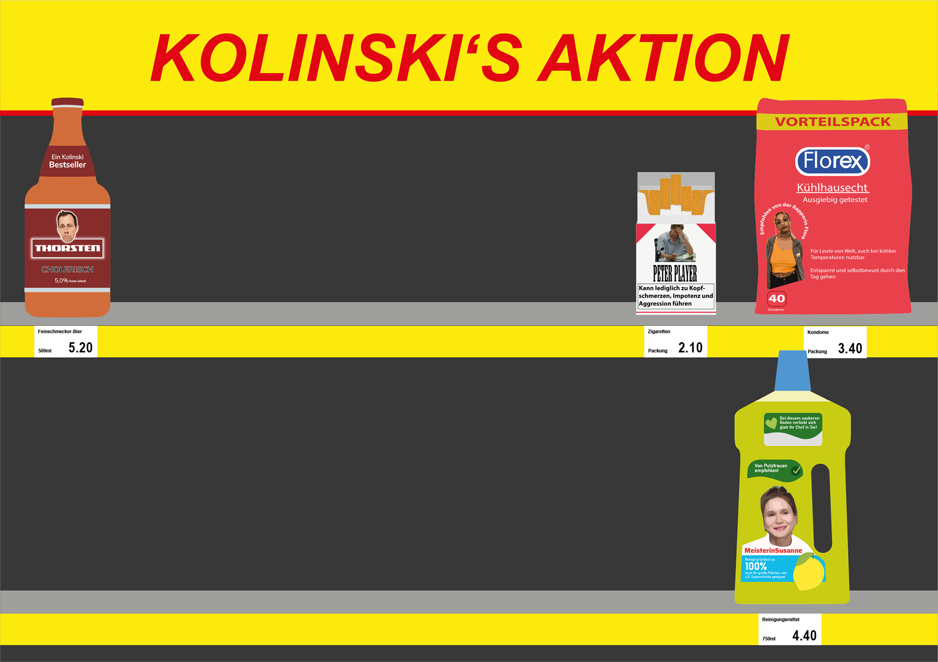
For the shelf, we made a few prototypes, first placing photos of the products we wanted to illustrate. The shelf canged slightly as we designed the price tags and used the original colours. One by one, each product was added to the shelf and they all came together. Certain products had to be changed out because their meaning or shape did not fit perfectly.
We also added some extra elements like a mouse or cigarettes, which should create chaos.

Finished Poster
To sum up, we incorporated a lot of information about the series into the poster. First we have the products which represent each character and have information about them written in the slogans. Then the products are sorted according to the hierarchy of the people's workplace. The price on the price tags gives an indication of the actors' age. And lastly there are some random elements (mouse, cigarettes,...) that appear in the series and give an idea of the chaos in the supermarket.
The final touches were shadows and a slightly textured background to add dimension.
To present the infographic in class, we printed it in A1 size.
Mini-Game
In addition to the poster, the task was to create a digital approach on the series. We brainstormed ideas like we did with the infographic. Then it was clear that we wanted to make a little game prototype. The concept was a little bit like Pacman. The boss of the discounter would have to chase his workers who are causing chaos in the supermarket. Then there are extra elements like animals that give extra points and the joker, who is superior to the boss and chases him, if he doesn't do his job properly.
We designed all of the elements in Illustrator and made a few prototypes for the layout. We then animated the whole scene in After Effects to bring our prototype to life.

Conclusion
This project was a great opportunity to learn more about infographics. Even though we didn't do a classic infographic, but rather a fun approach, it fitted the series perfectly. It was also the first project where I got a deeper insight into Adobe Illustrator. The digital game also allowed me to work with After Effects again, which I really enjoyed. The opportunity to work with Amazon Prime was also interesting. We had to present them our latest results and were given information on how to continue our work.
Other Team Member: Jacob Latiff